| The True and Only Dreaded Yellow Sign |
 |
 |
| The True and Only Dreaded Yellow Sign |
|
|
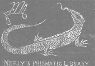
What does the true "Yellow Sign" look like. I was under the impression that it was the symbol next to the salamander on the cover of the true first edition of "The King in Yellow". A person who seemed to know what he was talking about told me that I had it all wrong, this was just the logo of F. Tennyson Neely, the publisher of the book.
I later found out that this person was not the all knowing expert on Robert W. Chambers that he likes to pass himself off as, so it should come as no surprise that he was wrong on this too.
A new Chambers site on the web, Miskatonic University - English Literature Department, had a scan of the cover of the second binding of TKIY. I had seen the covers of the first, third, and fourth bindings before but not the second.
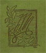
So what is on the cover of this second binding of the F. Tennyson Neely first edition that would change my mind back to my first way of thinking? The cover of the second binding has the same symbol that my expert told me was the Neely logo. The symbol is all by itself in the middle of the cover. Why would a company, even an egotistical company, use its logo as the sole cover design?
This leads me to believe that I was right in the first place. That this symbol is the true and only dreaded Yellow Sign. Therefore I am returning to the old sign and will no longer use the three armed Nazis looking symbol.
I have also learned to do my own research from now on and not let other people impress me with their seeming knowledge.
A number of people see a clear "F" "T" & "N" in the sign and put forth that this is a Neely
logo. The cover below is from 1901. It is possible that they changed their logo within 6 years.
It is also possible that neither design is a logo. That's what I think.
Thanks, but I can do one better. Attached is absolute proof that the
symbol in question IS the F. Tennyson Neely monogram and not the Yellow
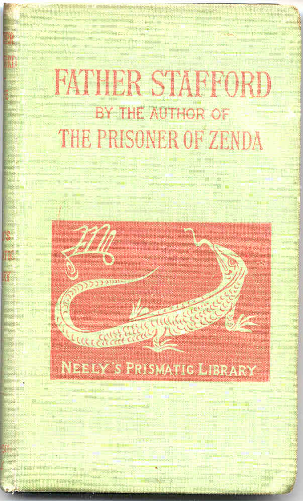
Sign. The image is of the book FATHER STAFFORD by Anthony Hope, published
as part of the NEELY PRISMATIC LIBRARY in 1895, and bears the monogram and
the salamander, exactly as THE KING IN YELLOW.
It's amazing what 30 minutes of research can turn up. I hope you will
credit me, if you post this information on your web site.
I don't think anyone will (or should) ever know what the Yellow Sign looks
like. It could make you insane, you know
Jack L. Thomas
On Sat, 4 Sep 1999, Larry Loc wrote:
attached is the likeness of a 1901 F. Tennyson Neely Co. cover with what
may be their logo on the cover. It is not the same as that appearing on
TKIY. I believe that you are wrong about me being wrong. It's possible
that they changed their logo but it is also possible that neither image
is a logo. And therefore, the image appearing on the first 2 editions of
TKIY just might be the yellow sign.
Jack L. Thomas wrote:
I recently happened across your web page and found it very interesting,
being a fan of H.P. Lovecraft, and to his obvious influence, R.W.
Chambers. However, I must disagree with you completely about your
thoughts on the "Yellow Sign" on the cover of the F. Tennyson Neely
editions of the KING IN YELLOW. The person telling you this was a
monogram was correct. First, it was not uncommon (or egotistical) for
publishers of the time to simply have the book's title and their monogram
on a cover. Secondly, while the yellow sign plays prominently in the
stories, it isn't the title -- the title is THE KING IN YELLOW, and
therefore it would not necessary make sense to have a yellow sign as the
sole cover image. Thirdly, the symbol is obviously a stylized, cursive F,
T and N -- the initials, (and hence monogram) of F. Tennyson Neely. But,
finally, and most importantly, the frame outline with the leaves of holly
is absolutely indicative of a monogram logo, and not the dreaded yellow
sign. I agree with you that the Chaosium "Yellow Sign" is not very
appealing. I prefer to believe that no one knows what the yellow sign
looks like.
I welcome your comments on the subject!
-J. Thomas
--
Larry Loc